Ever opened an email from a brand you subscribe to, only to feel a split-second of confusion? The logo is in a new spot, the colors are slightly off, and the call-to-action button looks completely different from last week’s. It just doesn’t feel like them.
That momentary hesitation isn’t just you being picky. It’s a tiny crack in the foundation of trust between you and that brand. While marketers often chase novelty with “fresh” designs, they overlook a powerful, silent force in building relationships: predictability.
In a world overflowing with information, our brains crave shortcuts. A consistent, standardized email format is one of the most effective shortcuts you can give your audience. It’s not about being boring; it’s about being instantly recognizable and effortlessly understood.
The Psychology of Predictability: Why Our Brains Love a Good Template
The power of a standard email layout lies in how our minds process information—a concept known as cognitive ease.
Coined by psychologist and Nobel laureate Daniel Kahneman, cognitive ease is the feeling of fluency and comfort our brains experience when processing information that is simple, familiar, and clearly presented. When something is easy to process, we’re more likely to believe it, trust it, and feel positive about it.
Conversely, when we encounter a chaotic, inconsistent layout, our brains experience cognitive strain. We have to work harder to find the information we need, which can trigger feelings of frustration and suspicion.
This preference for the familiar is backed by decades of research:
-
The Mere-Exposure Effect: First identified by Robert Zajonc in the 1960s, this is the principle that people develop a preference for things simply because they are familiar with them. When subscribers see your consistent header, fonts, and button style week after week, they develop a subconscious affinity for your brand.
-
Jakob’s Law of UX: Users spend most of their time on other websites and in other apps. This means they expect your email to function in a way that’s similar to all the others they already know. A logo in the top-left corner isn’t just a convention; it’s a user expectation that reduces mental effort.
When you force a reader to relearn your layout with every email, you’re not just being creative—you’re creating unnecessary work and eroding the effortless trust you’ve worked so hard to build.
The Hidden Costs of Inconsistent Formatting
Sending emails with unpredictable layouts isn’t just a minor inconvenience for your subscribers; it has tangible business costs. Inconsistency creates decision fatigue, a state of mental exhaustion from having to make too many small choices.
Think about it:
- Where is the main headline?
- Is this link clickable, or is it just underlined text?
- What is the main point of this email?
- Where is the button to learn more?
Forcing your audience to answer these questions every time you hit “send” depletes their mental energy. The result? They’re more likely to abandon the email or, worse, hit unsubscribe. And the data backs this up: according to Litmus, 33% of mobile users unsubscribe from brands that have poor mobile design and a frustrating experience.
The standardized format allows the reader to absorb content instantly. That’s the power of cognitive ease in action.
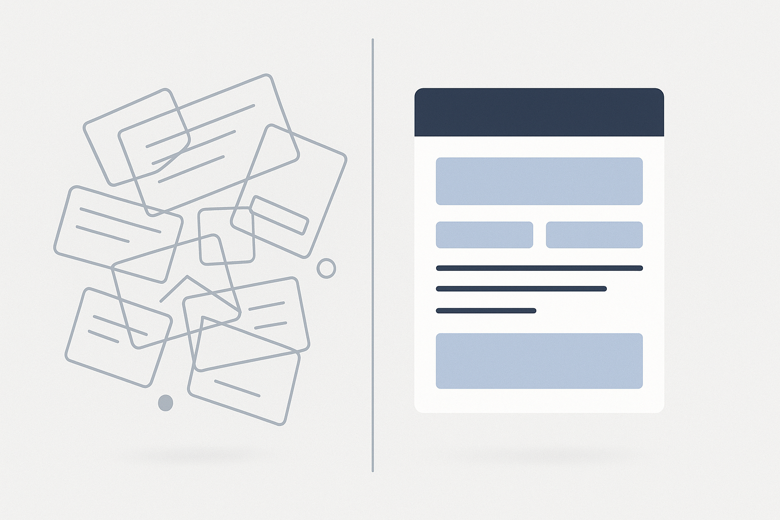
The Anatomy of a Trustworthy Email Template
Creating a standardized email template isn’t about stifling creativity. It’s about building a reliable canvas where your message can shine. A strong template acts as a familiar handshake, letting your subscribers know it’s you before they even read the first word.
Here are the essential components of a high-trust email structure:
1. The Unmistakable Header
This is your digital letterhead. It should be the most consistent part of your email.
- Logo Placement: Typically top-left, where the eye naturally begins.
- Brand Colors: Use them consistently to reinforce your visual identity.
- Navigation (Optional): If you include links to your site, keep them in the same order and style.
2. The Scannable Body
No one reads emails word-for-word. They scan. Your job is to make that scan as effortless as possible.
- Clear Headlines: Use a consistent font size and style for headings to create a clear visual hierarchy.
- Short Paragraphs & Bullet Points: Break up walls of text to make information digestible.
- Generous White Space: Give your content room to breathe. It reduces clutter and guides the reader’s eye.
3. The Singular, Unambiguous CTA
WordStream research found that emails with a single, clear call-to-action can increase clicks by 371%. Decision fatigue is real; don’t confuse your reader with multiple competing buttons.
- Design: Use a consistent button color, shape, and font. Your reader should know what your CTA looks like at a glance.
- Language: Use clear, action-oriented text (e.g., “Read the Guide,” “Shop the Collection”).
4. The Predictable Footer
This is a critical area for trust and compliance. Keep it clean and organized.
- Contact Information: Your physical address reinforces legitimacy.
- Social Links: Use consistent icons.
- Unsubscribe Link: Make it easy to find. Hiding it erodes trust faster than anything.
The payoff for this consistency is significant. Consistently presenting your brand across all platforms—including your emails—can increase revenue by up to 23%. A template is your first and best tool for achieving that.
Beyond the Inbox: Structure, Trust, and AI
Building trust through a clear, consistent structure isn’t just for email. In today’s digital landscape, your audience isn’t just human; it also includes the AI search systems that increasingly guide how people discover information.
Just as a human brain relies on familiar patterns to establish trust, AI models rely on structured data and consistent signals for machine understanding. When your brand presents itself clearly and predictably everywhere it appears online, you make it easier for both people and algorithms to understand who you are, what you do, and why you matter.
Frequently Asked Questions (FAQ)
1. Won’t a standard email template get boring for my readers?
Consistency isn’t boring; it’s reliable. Think of your favorite coffee shop—you go there because you know exactly what to expect. The reliability of the experience is what makes it enjoyable. Your creativity should shine through in the content within the template—the compelling copy, stunning images, and valuable offers—not in reinventing the layout every week.
2. How often should I update or change my email template?
Only when you have a compelling, data-driven reason to do so. This typically happens during a major rebrand or if user testing and analytics reveal a significant usability problem. Avoid changing your template just for the sake of “freshness.”
3. Does this apply to all types of emails (promotional, transactional, newsletters)?
Yes. While the content blocks inside the email will change, the core structural elements—your header, footer, fonts, and CTA style—should remain consistent across all communications. This ensures that even a password reset email feels distinctly like your brand.
4. What’s the first step to creating a standardized template?
Start with a simple brand style guide. Define your primary logo usage, your color palette, and your header and body fonts. Once you have those foundational elements, you can build the layout around them, focusing on creating the clear, scannable structure we’ve outlined.
Your Next Step: From Consistency to Trust
A standardized email template is more than just a design choice; it’s a psychological tool for building a foundation of trust with your audience. By creating cognitive ease, you make your brand feel familiar, reliable, and effortless to engage with. You stop forcing your subscribers to think about how to read your email so they can focus on what it says.
This same philosophy of clarity and structure is key to success in the modern digital ecosystem. If you’re ready to apply these principles beyond the inbox and create a brand-specific template that ensures your brand is understood everywhere, we can help.